Composed to Be Seen: The Visual Principles Behind Floral Arrangements That Transcend the Vase
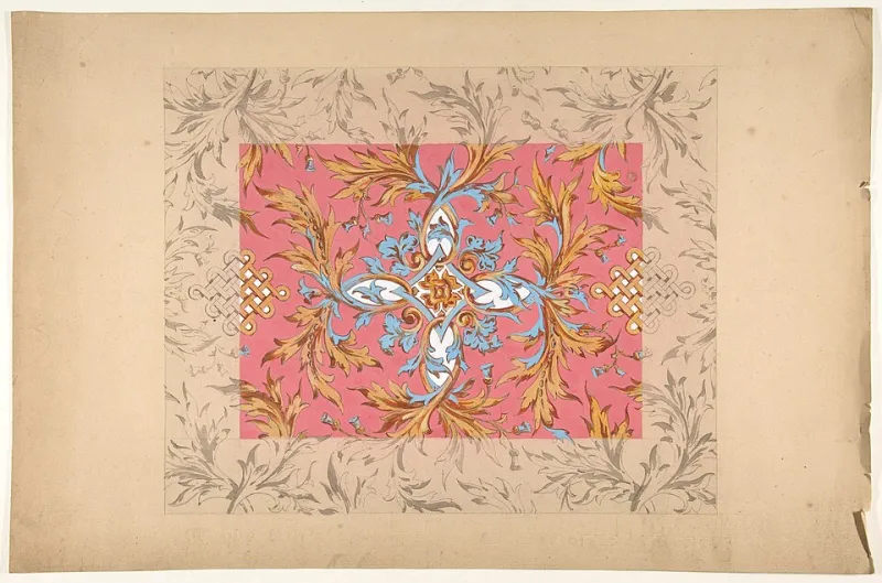
Photo: Jules Lachaise / Eugène-Pierre Gourdet, CC0, via Wikimedia Commons
There is a particular kind of floral arrangement that stops you mid-scroll. It is not merely beautiful in the conventional sense — it is constructed. The stems do not simply fill a vessel; they occupy space with intention. The colors do not merely complement; they create tension and resolution. The negative space does not feel empty; it breathes. This is the botanical blueprint that design-conscious consumers and professional floral artists are increasingly working from — one that borrows as much from visual art and photography as it does from horticulture.
The convergence of botanical design and digital aesthetics is not a passing trend. It reflects a deeper shift in how Americans relate to the spaces they inhabit and the objects they curate within them. When an arrangement is designed with compositional rigor, it earns a kind of permanence — photographed, shared, remembered — that a loosely gathered bouquet, however charming, rarely achieves.
The Frame Before the Flower
Before a single stem is selected, the most thoughtful botanical designers begin with the same question a photographer or painter might ask: What is the frame? In practice, this means considering the physical context — the surface, the wall behind it, the quality of available light — as actively as the arrangement itself.
Natural light from a north- or east-facing window produces the kind of soft, diffused illumination that flatters botanical work without flattening it. Harsh overhead lighting, by contrast, tends to collapse the dimensional quality that makes an arrangement feel sculptural. If you are designing an arrangement intended to be photographed in a specific location, visit that spot at different times of day and observe how the light behaves. The arrangement you build should be calibrated to that environment.
The background matters equally. A white wall creates clarity and allows color to speak without competition. A warm plaster tone or a richly textured surface adds depth and context, suggesting a lived-in sophistication. Neither choice is wrong; both are deliberate.
Depth as a Design Principle
One of the most reliable distinctions between an arrangement that photographs beautifully and one that does not is the presence — or absence — of depth. A flat arrangement, in which all elements occupy roughly the same visual plane, reads as decoration. An arrangement with genuine depth reads as composition.
Creating depth in a floral arrangement involves layering elements at different heights and distances from the viewer. Place your most substantial blooms — peonies, garden roses, dahlias, or large proteas — at the structural heart of the arrangement, slightly recessed. Allow lighter, more airy elements such as scabiosa, cosmos, or branching eucalyptus to extend outward and upward, creating a sense of movement toward the viewer. Trailing elements — a vine of jasmine, a low-hanging amaranthus — anchor the composition downward and add visual weight at the base.
This three-dimensional layering is what allows a camera to find a focal point and a natural sense of perspective, replicating the way the human eye naturally reads a painting or a landscape.
Negative Space Is Not Wasted Space
In American decorating culture, there is a persistent impulse to fill. A vase that is not overflowing can feel unfinished. But in botanical design — as in fine art and photography — restraint is often the most sophisticated choice available.
Negative space, the deliberate absence of material in certain areas of an arrangement, performs several functions simultaneously. It allows individual blooms to be read as distinct elements rather than as part of an undifferentiated mass. It creates visual breathing room that makes the eye move through the composition rather than stopping at its edge. And in photography, it provides the open area that allows for text overlay or graphic design, making the image inherently more versatile for editorial or social use.
Practically speaking, negative space is most effective when it is positioned with intention. A single arching branch extending beyond the body of the arrangement and silhouetted against a clean background creates far more visual drama than five branches clustered together. A bloom placed in apparent isolation at the periphery of a composition draws the eye outward and creates a sense of scale.
Color Theory in the Botanical Context
Color is the element most immediately registered by both the human eye and the camera sensor. Arrangements built on a coherent color logic — whether monochromatic, analogous, or deliberately contrasted — communicate a sense of authorship that undirected color mixing rarely achieves.
For photography in particular, certain color relationships perform reliably. Soft analogous palettes — blush, mauve, and dusty rose, or ivory, champagne, and warm terracotta — photograph with a cohesion that feels editorial and considered. High-contrast pairings, such as deep burgundy against silver foliage or cobalt-tinted thistles against pale cream, create the kind of visual tension that draws attention in a crowded digital feed.
It is also worth noting that the camera renders color differently than the human eye. Saturated, highly pigmented blooms — vivid orange, electric violet — can read as overwhelming in photographs, losing the nuance that makes them beautiful in person. Softening these with generous amounts of greenery, textural foliage, or lighter tonal companions restores balance in the image.
Texture as the Detail That Rewards a Closer Look
The arrangements that sustain interest — both in a room and in a photograph — are those that reward multiple levels of attention. At a distance, the composition reads as a whole. Up close, or in a tightly cropped image, the individual textures reveal themselves: the papery translucence of a poppy petal, the geometric precision of a protea, the velvety depth of a garden rose at full bloom.
Building textural variety into an arrangement means deliberately selecting elements from different botanical families and growth habits. Smooth and matte surfaces paired with glossy foliage. Spiky seed heads or thistles alongside the softness of ranunculus. The contrast is what makes each element more legible, and in photography, texture is the quality that communicates tactility — the sense that the viewer could reach into the image and feel the arrangement.
Why This Practice Matters Beyond the Feed
It would be easy to frame the design of photographable arrangements as an exercise in social performance. But the discipline of composing botanical work with visual rigor yields something more enduring than a well-performing post. It cultivates a deeper fluency with the principles that make any visual art form compelling — proportion, balance, contrast, rhythm.
When you begin to design your arrangements with a compositor's eye, the physical experience of the arrangement in your home also changes. Spaces feel more considered. The relationship between a floral installation and the room it inhabits becomes more articulate. The arrangement ceases to be an accessory and becomes, in the truest sense, a work of art that happens to be alive.
At Tierra Floral Design, this is the aspiration that animates every arrangement we compose — botanical work that is as visually intelligent as it is organically beautiful, designed for the room, the moment, and the enduring image it leaves behind.