Nature's Color Authority: How Blooming Seasons Quietly Dictate America's Interior Design Palette
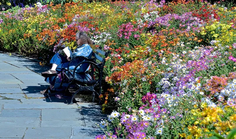
Photo: David McSpadden, CC BY 2.0, via Wikimedia Commons
The Color Conversation That Starts Outside Your Window
Every January, the design world holds its breath waiting for Pantone's Color of the Year announcement. Editors publish breathless roundups. Paint companies reformulate their featured collections. Furniture manufacturers race to upholster sofas in the anointed shade. Yet for those of us who work intimately with botanical material, there is a quiet irony embedded in this ritual: the most compelling color stories are already unfolding in meadows, marshes, and garden beds across the country—often months before any trend authority puts a name to them.
The connection between seasonal flower cycles and interior design trends is neither coincidental nor mystical. It is, in fact, a deeply practical relationship—one that professional floral designers, color theorists, and forward-thinking decorators have long understood and deliberately leveraged. At Tierra Floral Design, we consider botanical color an intelligence system in its own right, one that rewards those willing to observe it with patience and intention.
How Regional Bloom Cycles Function as Trend Laboratories
The United States is, botanically speaking, a remarkably diverse nation. The California poppy fields that ignite in burnt amber and persimmon each spring bear little resemblance to the cool lavender and dusty rose hues that define the lilac season sweeping through the Pacific Northwest and the upper Midwest. Meanwhile, the Southeast's camellias offer deep, saturated crimsons through winter months when northern gardens lie dormant, and the high desert Southwest produces a palette of terracotta, sage, and muted gold that has influenced Southwestern interior design for generations.
What this geographic diversity creates, effectively, is a rotating series of regional color laboratories. Designers who pay attention to what is blooming—and when—gain access to a palette that is simultaneously rooted in place, responsive to season, and culturally resonant with the people who live within that landscape.
"There is an authenticity to botanical color that synthetic trend forecasting simply cannot manufacture," explains one New York-based color consultant who works at the intersection of fashion and interior design. "When a color emerges from a living system—from soil chemistry, sunlight hours, and rainfall—it carries a kind of visual weight that feels earned. People respond to it emotionally before they can articulate why."
The Pantone Parallel: Prediction or Reflection?
It is worth examining how Pantone's forecasting process actually functions, because understanding it clarifies the relationship between institutional color prediction and botanical reality. Pantone's Color Institute draws from a wide range of cultural signals: art exhibitions, emerging fashion markets, consumer mood research, and—notably—the natural world. Their forecasters travel extensively, observing environments and landscapes as part of their methodology.
In other words, Pantone is not inventing color trends from thin air. It is, in significant part, observing the same natural phenomena that botanical designers encounter every growing season. The difference is one of translation and timing. By the time a color trend reaches the mass market—appearing in big-box home goods stores and mainstream shelter publications—it has typically traveled a long journey from its organic origin point.
For the design-conscious homeowner or professional decorator, this lag represents an opportunity. Those who cultivate a working knowledge of regional bloom cycles can anticipate the color directions that institutional forecasters will later codify. The dusty blue-green of late-summer hydrangeas in New England, for instance, tends to presage the popularity of muted teal and eucalyptus tones in interior palettes roughly twelve to eighteen months later. The warm, papery ochres of dried grasses and seed heads in the Great Plains have a habit of surfacing in textile collections the following spring.
Translating Botanical Intelligence into Interior Decisions
Practically speaking, how does one apply this botanical color awareness to home design? The approach begins with deliberate observation across multiple seasons, ideally in your own region.
Maintain a seasonal color journal. Photograph or sketch the dominant hues you observe in local gardens, farmers' markets, and natural landscapes throughout the year. Over time, patterns emerge. You will begin to notice which tones feel energizing in early spring, which carry a contemplative weight in autumn, and which possess the staying power to anchor a room across multiple seasons.
Bring living botanical material into the design process. Rather than selecting paint chips and fabric swatches in isolation, introduce actual flowers and foliage into your decision-making environment. Place a stem of ranunculus or a branch of flowering quince alongside your material samples. The way a living botanical color interacts with natural and artificial light is fundamentally different from how a printed swatch behaves—and often more instructive.
Work with what is locally and seasonally available. This principle serves both aesthetic and practical ends. Flowers and botanicals that are in their natural season in your region will be fresher, more affordable, and visually cohesive with the light quality and environmental character of that moment. A home decorated in dialogue with its surrounding landscape achieves a sense of groundedness that trend-chasing rarely produces.
The Designer's Advantage: Staying Ahead by Looking Down
Professional floral designers occupy a unique vantage point in the broader design ecosystem. Because we work with living, seasonal material every day, we are continuously engaged with color in its most dynamic and unmediated form. We watch peonies shift from tight coral buds to blowsy blush-pink blooms over the course of a week. We observe how the same dahlia variety reads entirely differently under the golden light of late afternoon versus the cool clarity of morning. This experiential intimacy with botanical color is, we would argue, one of the most sophisticated forms of design education available.
For homeowners and decorators who wish to cultivate a similar sensitivity, the invitation is straightforward: spend more time with flowers. Visit local botanical gardens with a critical designer's eye. Frequent farmers' markets not only to purchase arrangements but to study what is growing and how the season's palette is shifting. Follow the work of regional floral artists whose practice is rooted in the specific botanical character of their landscape.
The most enduring interiors are not those that faithfully mirror a trend forecast. They are the ones that feel genuinely connected to time and place—spaces that seem to know what season it is, what the land outside looks like, and what colors the human spirit needs in a given moment. Nature, as it turns out, has always been the most reliable design authority. Pantone simply helps the rest of the world catch up.